Recently, I had my annual performance review at work, and one of the things my boss said I needed to work on was communication with upper management in the form of not realizing they don’t know what I think everyone knows. I fully admit that there are some things so engrained in me that it would never dawn on me that other people do not actually know those things. Perhaps it is a reaction to the fact that I HATE being talked down to. I hate when people attempt to explain something to me I already know. The more basic the fact the more I hate it. It feels insulting. I hope those people where I have to go back and explain at a lower level, take it as a compliment, as it kind of is. I sometimes assume they already know things, and while I will correct it when necessary, it really is a compliment that I assume someone knows something they don’t. However, I do understand what my boss was saying, and science communication is something a lot of scientists talk about a lot. How can scientists improve science communication so that non-scientists can understand science, especially since science concepts sometimes are complicated?
So in one of those striking coincidences, the same day I have my performance review, the World Health Organization (WHO) comes out with a report that says that processed meat is carcinogenic to humans. The blog post is not meant to go into a discussion of how badly this report was blown out of proportion by much of the media. I will just say there is a difference between relative risk and absolute risk. This Forbes article I think does a pretty good job of explaining what the WHO said and also what it means, and this post by Cancer Research UK is really good and has wonderful graphics explaining risk. I will also say I am not a vegetarian, and although I really don’t eat that much red meat or processed meat, I don’t have a thing about bacon, but I spent a good part of childhood in Texas, and God bless Texas barbecue, meaning brisket so tender no knife is needed, and now I am hungry. I’m sorry where was I? Oh right, WHO and processed meat. So what I did want to say a few words about was a graphic I saw on NBC Nightly News, mainly the image below (which in case it is not obvious, I literally took a photo of my television screen).
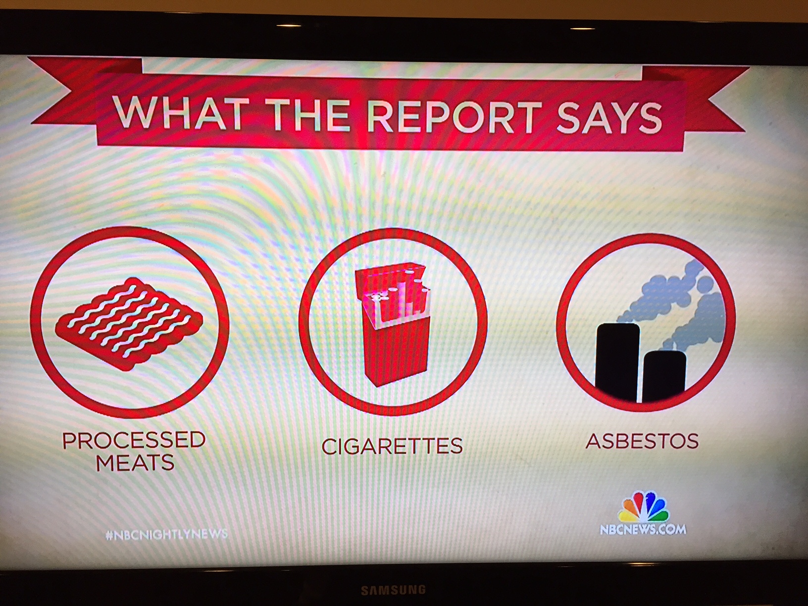
Screen shot of NBC Nightly New with Lestor Holt on 10/26/2015
I am not an expert on asbestos, but I can say with confidence that a smokestack is NOT where asbestos originates. Asbestos is a naturally formed mineral, and in some locations, you can be exposed to asbestos from the natural soil and rock near you. Where people generally get asbestos exposure is old house insulation, old pipe insulation, car brake pads, and a whole lot of old building material. I posted this photo on Facebook yesterday because I was just kind of flabbergasted. It leads me to questions like does NBC News seriously not know where asbestos comes from? Are they just too lazy to find a better graphic? One Facebook friend said that maybe they used a smokestack to designate a generic industrial process. I replied that by that analogy cigarettes should also have a smokestack because they also come an industrial process. Asbestos does not originate from an industrial process. It originates from the earth, but it was then used by industry into various products. The other two graphics imply where your exposure to the named carcinogen would be. Your exposure to asbestos is not from a smokestack. It is from old building material like insulation. They could have had a graphic of fibrous pipe insulation. They could have also just had a graphic of fibers to show what asbestos looks like under a microscope. I feel confident that with a short period of time and a graphic designer, we could have come up with a factually correct and simple asbestos graphic. One may very well already exist. This reply led to a bit of a discussion between my friend and I that was partially about science communication. In short he said that because my reply was so long explaining the problems with the graphic, that he stood by his opinion that the graphic was fine. I acknowledge that my reply was long, but I was not wrong on any points. Also the NBC graphic was just plain bad. A smokestack does not in any way represent asbestos. Worse than that it provides incorrect information to an uninformed viewer who might think that a smokestack is in fact where asbestos exposure comes from.
I very much respect the points my friend made, and he did state something that gets at the heart of a problem I often have, which is brevity. [How long is this blog post now?] I have a tendency to give long answers, which I understand can be annoying to management or anyone else, who wants a short answer. The reason I sometimes give long answers is that the answer is not simple, or I need the question defined better in order to give a simple answer. I just can’t bear the idea to give an incorrect answer. I can’t bear to give a short answer to management then have someone come back and say well what about “this”, and management to come back at me and say well what about “this.” I work in complicated subjects. Very often the problems, the solutions, the questions, and the answers are all complicated. The problem with the media sometimes is they try to make a complicated subject simple and sometimes fail miserably. Sometimes they just have no clue what they are talking about and seem to refuse to want expert advice. I respect journalists who can take complicated science subjects and explain them simply. There is a difference between explaining something simply and accurately and explaining something simply and wrong. Asbestos coming out of a smokestack is simple. It is also wrong.